The Art of Photojournalism
 |
| Photo By: Jerad Hobaugh Year Created: 2008 |
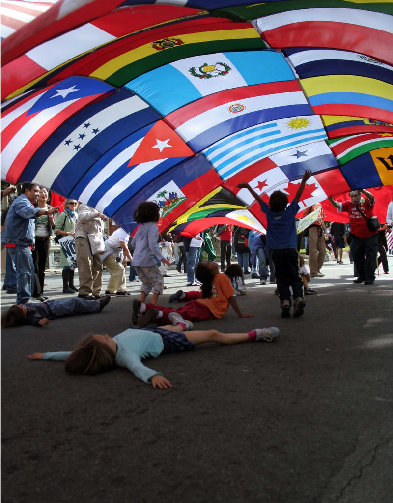
The light is surprising, this is because we see kids and families enjoying the view of different flags. It is important for everyone to know about each flag, race and ethinicty. The direction of the light impacts the image because it's focused on the flags.
Principle #2: Exposure time
The kind of shutter speed used in this image is freeze action, this is because the photograph was taken in the middle of kids playing and looking at the flags. The shutter did freeze the action and created sharpness. The shutter speed created a feeling of speed or movement because everyone seems happy.
Principle #3: Rule of thirds
The kids laying on the floor and the flags on the top. The photographer did not really avoid placing the frame in the middle because the image was right in the middle. If the image was be divided, you can still see the Ain subject of the image.
Why did I choose the image?
I choose this image because it caught my attention. Kids are enjoying the moment and having a good time without any cellphones, tablets, or any use of the internet. The image is showing the beauty of each flag.
 |
| Photo By: Jack Delano Year Created: 1941 |
This image is black and white in a time that the photographer had a choice to not take it black and white. The era of color photography was in 1935. The impact of this image
Principle #2: KEEP IT SIMPLE
The composition of this image is simple. This picture is considered simple to me because it only has two regular signs on each door. Each door also has the same design.
Principle #3: Subject's Expression
The two adults and the younger boy look relaxed in this image and not overly posed.They do not seem to be blinking. They are definitely posting for the photographer. Their body language fit their facial expression because they are just looking straight ahead.
Why did I choose the image?
I choose this image because was interesting to see how barber shops were back then in the island I was born in. It is always nice to see how things were built back in time. Also, on the left door you can see how barbershop chairs have changed.
 |
| Photo By: Louis Daguerre Year Created: 1838 |
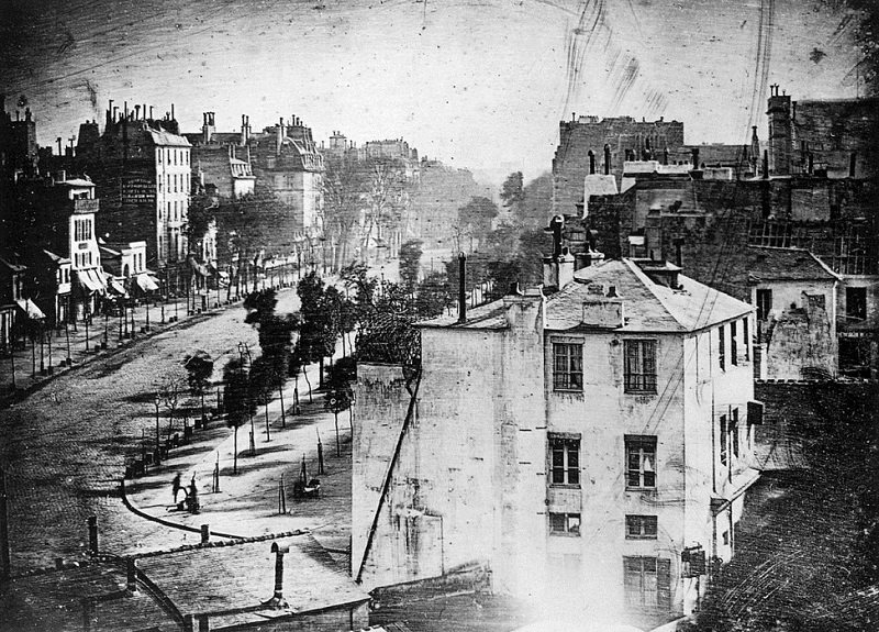
The contrast of this image is low. This image has very dark areas. There isn't very much difference between the lightest and darkest areas because you can't see the importance of this image.
Principle #2: Texture
This image looks rough. The feeling this image creates is a historical image. The image looks very old and the quality isn't so good.
Principle #3: In or out of focus
The image is out of focus. Is this image focused on the buildings, the road, or the trees. the image isn't sharp.
Why did I choose the image?
I choose this image because it is very old fashion. Also, because it's the one picture I could find from the 1800 with a photographer's name. I would love to know how this image was taken.
 |
| Photo By: Nahiomy Martinez |
The image is a bit cluttered. There are plants on the floor and coming up on the right side of the picture. Also, it has many other object contradicting with the image, many different colors.
Principle #2: What feelings does the image create?
This image capture my attention because I've always thought that it was cool to have the a figure of an animal and you're able to put your face on it as if you were the animal. In this picture, a butterfly. In my opinion, this image has a very good value because of course, it's my little sister. The image itself won't grown on me, but she will grow and I will loopback at this picture when she keeps growing up to see how much she has changed.
Principle #3: Is the image black & white or color?
This image is color. This image was not taken at a time when only black and white was possible, because this picture is recent and we are able to take color pictures now. But in another point, I could have had the choice to make the image black and white because iPhones have that option (filter photo) or I could have edited the image and change the color.
Why did I choose the image?
I choose this image because I recently went to a butterfly small museum and what's better than my beautiful sister as a butterfly. Also, this image is bright and colorful.

No comments:
Post a Comment