Photojournalism and Bias
 |
| Photo By: Ed Clark |
Principle #1: Keep It Simple
This image is cluttered. There are a couple other people in this image in which they all have different facial expressions. The trees in the back and the big white poles were making it seem a bit cluttered.
Principle #2: Is the image black & white or color?
This image is black and white. The image was taken at a time were color images were not as easy to get unless you had the right amount of money. The impact of this image was to be captured when there were strong feelings being seen in order to catch people attention or to emotionally connect to others.
Principle #3: Background compliments or detracts from composition
In my opinion, for this image there is a little of both. In this image, there is a female to the bottom right of this image that shows the same feeling as the officer in the image. But on the other hand, there are other people in the background of this image that compete for attention. In the image, there are multiple females that are looking at the main object (the officer) , with serious faces as if they are not feeling the same type of hurt as he is or they are upset. It brings a confusion to the image. The background is out out focus, they are slightly blurred out.
"Going Home" Image
This image shows a strong attention to the males feelings. This image is showing, tears streaming down the cheeks of a Chief Petty Officer as the President Franklin D. Roosevelt's flag-draped funeral train leaves Warm Springs, Ga. In this image, I see an officer feeling completely upset. He seems to not be holding in the pain. I feel like this image was captured to show the emotional feelings of this officer towards the President, as if they might have had a close relationship. It's very hard to handle a loss of someone you know and everyone griefs differently. As I was writing this, I came across what was mentioned in the article, to symbolize not merely a nation’s grief, but black America’s acknowledgement of Roosevelt’s efforts on behalf of civil rights. Asking myself, what does this image mean to me? Well this image shows that you can gain emotional feelings knowing that the world might change to that person because of having to deal with another president or that the nation had lost such a beautiful and understanding soul. That is what the image is shows personally to me but everyone has their own meaning to images and connections.
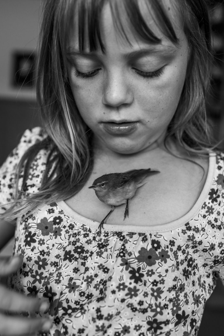
In his image, there is a young girl calmly looking at this bird sitting on her chest. While reading the article, What are the four Ways of Knowing (WOKs)?, I noticed the way I figured and knew this image was real was by using my sense perceptions; You know certain things because you can see and perceive them yourself. Empiricists consider sense perception so important that they will say that all knowledge comes from the senses. The image was more so captured in the "moment". What do I mean? For example, no matter what way this image could have been taken, it would still capture the same expression and the same truth to the image. As professor Nordell mentions in the Photojournalism and Bias Video - Part 2, "The decisive moment a photojournalist striving to capture the peak action". In my opinion, I love to look at images that are so natural were you don't have to do too much to capture a great moment. As it is mentioned in the Yellow Journalism article, "Some of the Journal's most notable exclusives came close to home.
Year Created: 2014
Principle #1: Depth of field
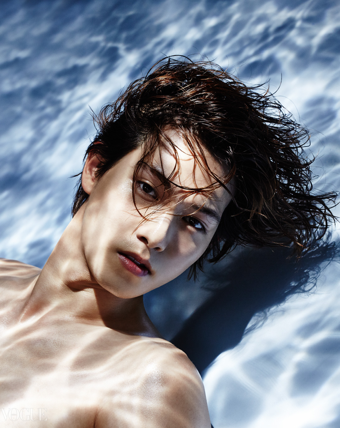
In my opinion, the right amount of area was not in focus. This is because there's a male in this image were there is also a background that seems to be water but isn't. This image uses the shallow of water. This directs my attention because you question yourself for a second. This picture looks so perfect to be an image that is intended to look like it is under water.
Principle #2: Contrast Appropriate
This image has a little of both very bright and dark areas. The overall images is very bright, it allows it to sort of have a shadow. On the other hand, it's not as bright, it has dark areas. When it comes to his eyes, the light is dark, nothing is brightening the eyes.
Principle #3: Quality of Light
I would say the light is engaging. The direction of the light impacts the image. This is shows that the point of the image was to make it believe that he was underwater and with the right amount of light this came out perfect. The bright light reflecting the water made it all seem very engaging.
Image A Truth
 |
| Photo By: Carla Kogelman |
Year Created: 2014
Principle #1: Obvious main subject
The main object of this image is this young girl calmly looking at the bird. The main object is not crowding the edges. If the impact of the image and certain object of this image were left out, the image wouldn't be as interesting. If the photographer had blurred out the young girl and only took a picture of the bird, it wouldn't be as interesting or as adorable as the picture was taken at first.
Principle #2: In or out of focus
This image is in focus. I say this because the background is all blurred out and the soft focus is mainly on the bird and young girl. This helps create the overall feeling because by looking a the image you can picture yourself being the girl looking at the bird with so much interest or also you could probably see yourself telling the girl "hey hey, hold on let me take a picture" and the young girl trying to stay completely still.
Principle #3: What feelings does the image create?
The calm facial expression of this young girl created the interesting feeling to this image. The image captured my attention because it reminded me of a time when I went to a butterfly museum, the way the butterflies would sit on my shoulder and I would have the same the interesting look, looking at the butterflies.
In his image, there is a young girl calmly looking at this bird sitting on her chest. While reading the article, What are the four Ways of Knowing (WOKs)?, I noticed the way I figured and knew this image was real was by using my sense perceptions; You know certain things because you can see and perceive them yourself. Empiricists consider sense perception so important that they will say that all knowledge comes from the senses. The image was more so captured in the "moment". What do I mean? For example, no matter what way this image could have been taken, it would still capture the same expression and the same truth to the image. As professor Nordell mentions in the Photojournalism and Bias Video - Part 2, "The decisive moment a photojournalist striving to capture the peak action". In my opinion, I love to look at images that are so natural were you don't have to do too much to capture a great moment. As it is mentioned in the Yellow Journalism article, "Some of the Journal's most notable exclusives came close to home.
Image B Not Truth
 |
| Photo By: Vogue Korea |
Principle #1: Depth of field
In my opinion, the right amount of area was not in focus. This is because there's a male in this image were there is also a background that seems to be water but isn't. This image uses the shallow of water. This directs my attention because you question yourself for a second. This picture looks so perfect to be an image that is intended to look like it is under water.
Principle #2: Contrast Appropriate
This image has a little of both very bright and dark areas. The overall images is very bright, it allows it to sort of have a shadow. On the other hand, it's not as bright, it has dark areas. When it comes to his eyes, the light is dark, nothing is brightening the eyes.
Principle #3: Quality of Light
I would say the light is engaging. The direction of the light impacts the image. This is shows that the point of the image was to make it believe that he was underwater and with the right amount of light this came out perfect. The bright light reflecting the water made it all seem very engaging.
For Image B, I decided to include two images to further show the "scene" behind the image, to show actual the truth. The image taken of this male is made believe he is under water. As it is mentions in the Vantage article, Just because a photo looks like photojournalism, doesn’t mean it’s Photojournalism. At least that's what it seems like they are trying to show. In the video, Photojournalism and Bias - Part 2, Professor Nordell mentions, "Their goal is opening doors, opening minds that is open doors for the photographs and ideas of you point of photographers from developing nations while at the same time opening the minds of individuals from other nations to see the world in a different way" This might be the goal of the Vogue Korea magazine. To show different ideas and make the image more interesting for everyone to look at. To have the face of a different person that comes from a different culture on a magazine. For this image, this male must have agreed to taking the picture as long as they made him look very well presented and have an interesting background that everyone will be interesting in. And I feel like this is what photojournalists do, to try and capture the perfect image. As professor Nordell mentions in Photojournalism and Bias - Part 1 video, "The rule that I wouldn't want to photograph somebody in a way that I myself would not want to be photographed so true can change your outlook your biases can change over time". As I was reading the article, What are the four Ways of Knowing (WOKs)?, When I took a quick glance at this image at first, I noticed this image was not the truth by using my logic, "You know certain things because you can apply logics and reasoning. Rationalist consider reason and logics so important, that they say that all sources of our knowledge comes from our ability to use reasoning.
 |
| Photo By: Vogue Korea |

No comments:
Post a Comment